Design System at Raisa


More Teams are changing the way they design digital products by incorporating their unique design systems. By utilizing a collection of repeatable components and a set of standards guiding the use of those components, the change has been proven to affect the pace of creation and innovation. In the last couple of months, we at Raisa have been building our design system. We want to share our take on design systems, and our experience building the first iteration of them.
What is a design system?
There are lots of various definitions of what is a design system, but for the sake of this article, we will simply define it as a collection of reusable components, guided by clear standards and style guidelines that can be assembled to build consistent digital products at any scale. We will simply define it as a common language across the working teams.
The main goal of a design system is to reduce communication friction between business, design, and development teams. This comes in the form of named components, tokens, guidelines that we all agree on and gradually they become part of our everyday communication.
Why Use a Design System?
Having a design system in place offers a lot of benefits for developers, designers, and business stakeholders.
These benefits can be summarized in:
- Work can be created and replicated more quickly.
- Engineers can shift their focus from styling to more important and complex problems when working on new features.
- Visual consistency across different digital products.
- Communication consistency/efficiency across the team, communicating how a button would look like in every screen should not be the case.
- The ability to prototype new features quickly knowing that we have the main building blocks ready to be used.
Building Design System Components
Implementing components is the biggest investment that the team will put in terms of time and effort, so careful decision need to be made to streamline the process of implementation and usage. The overall goal is to enhance the developer experience while maintaining a certain component or just using it to build a new feature.
Couple of things we believe should be considered while building components:
- Building Isolated Components: Having components that are isolated and independent of each other, unaware of their outsides is a very crucial part of this process, and it's the first step to unlocking reusable components.
- Consistent Interface: For other developers to use these components efficiently, its interface should be solid and consistent with minor breaking changes as possible.
Implementing the Component
Following a Pattern when thinking about components, helps keep them consistent and easy to reuse. We decided to follow the Base + Variant Pattern. In this pattern, you have a base component that contains the least basic usable functionality and styles. Then you start adding variant components that use this base component as needed (think inheritance in OOP).
The base component is private meaning it should not be used outside the design system instead it is used inside each variant. And then we use the variants inside of our applications. By following this pattern, the components will unlikely get big and ugly. Instead, building a variant for each use case and these variants only depend on the base component. We encourage you to watch this great presentation by the Airbnb Team to get a better understanding of this concept.
Here is a simplified version of the button component in our Design System. The base component with pieces of code that are not going to change across all button variants (like the button HTML tag, on click handler, class name, and disabled prop). Also, this button has little to no styles applied to it.
function ButtonBase({ className, children, onClick, disabled, ...rest }) {
  return (
    <button type="button" disabled={disabled} className={className} onClick={onClick} {...rest}>
      {children}
    </button>
  );
}Here is our main button component Extending the base component and adding to its various props that change the size, type, and color of that button. Note that none of these components is exceptionally large. And in the future if we want to make an Icon Button, we will also extend the base Button. This ensures we never have one component that does it all; making it much easier to maintain, add to these components, or refactor them in the future.
function Button({ type, variant, size, children, ...rest }) {
  const className = `ds-button ds-button--${size} ds-button--${type}-${variant} `;
  return (
    <ButtonBase className={className} {...rest}>
      {children}
    </ButtonBase>
  );
}
Styling
When it comes to styling there are many ways and methods, each of them offers some pros and cons. We decided to go with the simplest method and just use plain CSS just because we didn’t want our styling to be tied to one framework or library in case we decide to switch from React in the future, migrating styles should be easy. We then found that we needed some extra functionality with our styles like the ability to use variables, import and extend styles. We then used Sass as a compromise between simplicity and functionality.
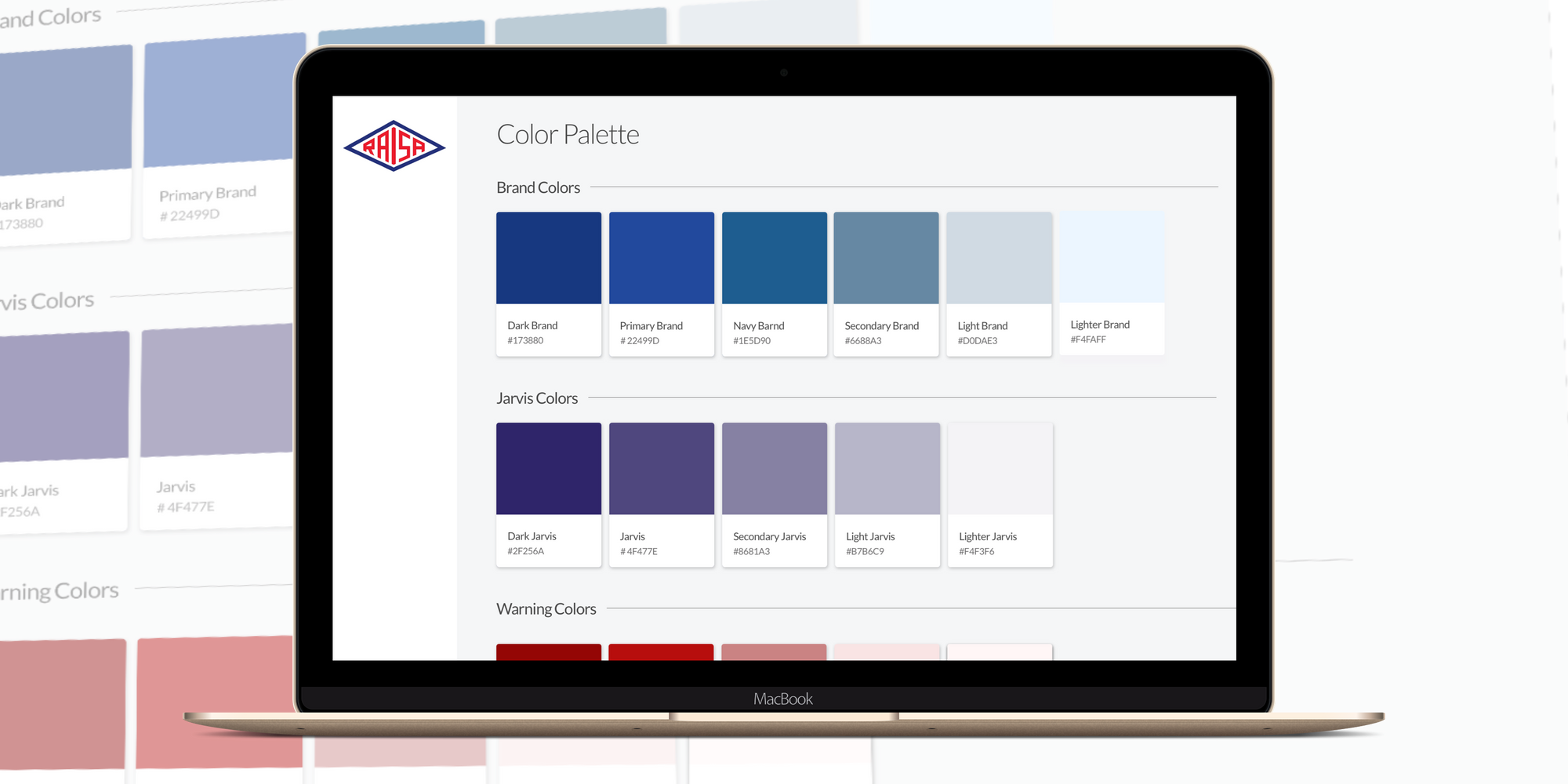
Design Tokens for colors, fonts, borders, shadows …etc. is what differentiates one design system from another and they are used throughout our system. We store our tokens in Sass variables that we can import and use in all of our components. Tokens will empower designers to change aspects of the general look & feel without any substantial amount of coding needed.
Design Tokens
A very crucial part is keeping those tokens updated and matched across the design and the dev team.
The main goal of using and unifying design tokens between design and development is to give designers the power to basically change the look and feel of all apps from their side without development effort. check this style dictionary demo to understand how much power this provides.
Fortunately, our designers use InVision DSM, this facilitates the process of exporting design tokens through a JSON format that is ready to be consumed by tools like style dictionary to automatically generate tokens that could be used in different platforms like android XML, CSS variables, etc...
Documentation
An important aspect of creating a design system is documenting and making them easy to use them. Building components that are not well-documented defeats the purpose and could lead to them being used in unintended ways or completely abandoned. We are using Storybook to develop, test, and document our components. Storybook is the most popular tool for this goal in the React community and we believe it's achieving the goal.
Some of the things that we love and use in Storybook:
- Controls: we use this to see how changing props affect the component's look and behavior.
- Decorators: We use global decorators to add most of our global styles and tokens.
- Measure & Outline: Our design team finds this tool easier than the browser’s computed tab in the browser dev tools. (These are Only for developers, apparently).
Rolling it out
We investigated some approaches on how to roll out a design system to an existing application, which is the case for Raisa. Also, we do not have an excessively big team, so we cannot afford having 2 or 3 developers dedicated for delivering all the design system components beforehand.
We decided to introduce new components to the system while rolling out new features. Hence, we can continue adding business value every sprint while testing components and features simultaneously. We also find this to be a fantastic way to have a flexible design system that matures and evolves based on the business needs.
Impact
- We started noticing a substantial impact with the first few components we made.
- Rolling out new features went smoother than before and there was less friction on how things should look like and behave.
- Having a common language across the working teams (business, design, and development) made communication much easier where we always make references to our components and token names.
Next Steps
Design Systems help achieve higher efficiency, consistency, and scalability. We at Raisa are happy with our current design system and continue to build upon it. We believe it is a great investment and we hope that this article sharing our experience could help start your design system.
In the next post, we shall talk more about how we keep adding new pieces to our design system and the process we have to introduce changes if needed.